
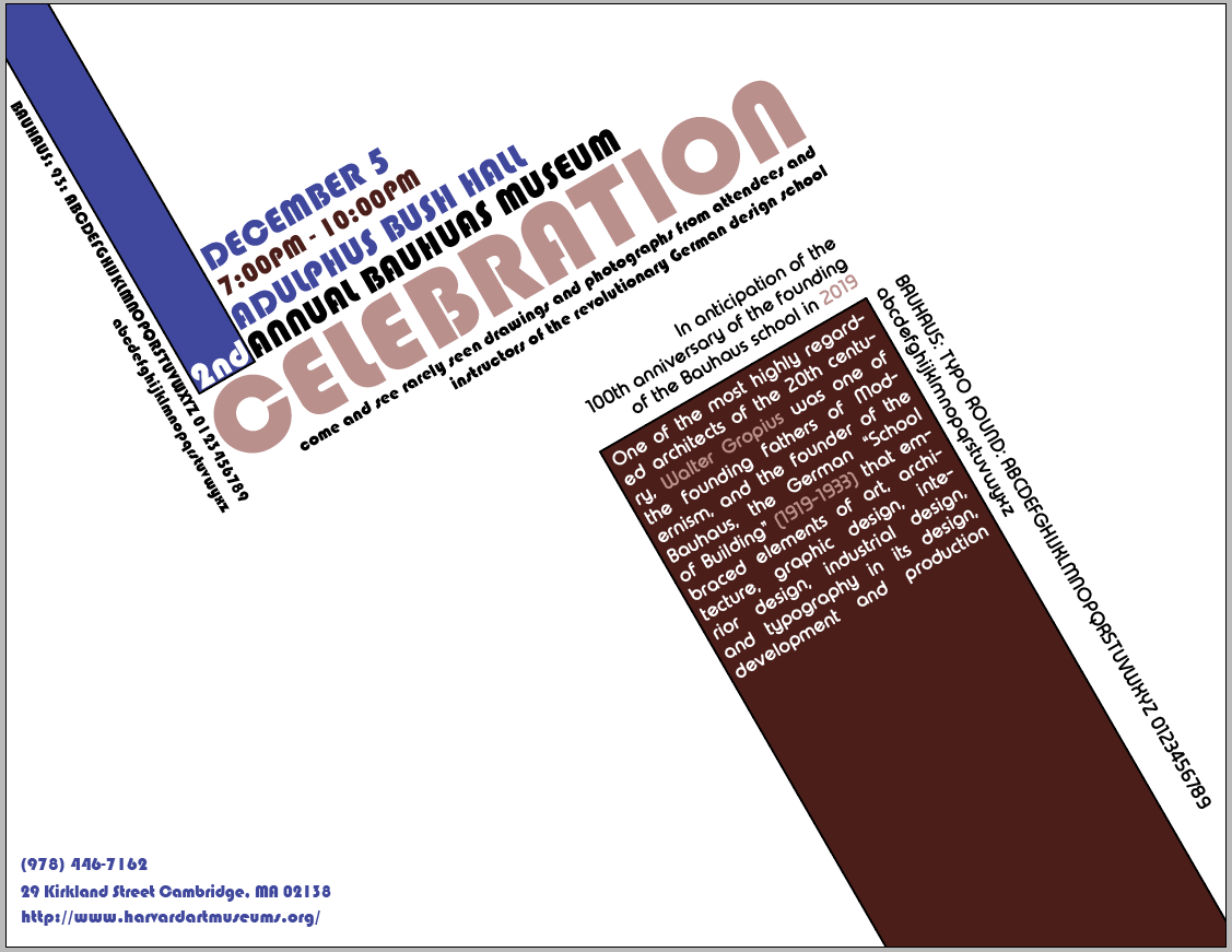
This Bauhaus project had many requirements. Research a type face. Include the type face in a design that is authentic to the time period. A design with only type? Bauhaus!! "Graphic design at the Bauhaus focused on typography, shape and color. Professors integrated the tenets of modernism into the classes and workshops. In product design, furniture making and architecture, design for the masses slowly replaced Gropius' original idea of designer as craftsman. In graphic design, however, the refinement of form and typography maintained the concept of craftsmanship. Typography was one of the Bauhaus' greatest legacies; it was bold and clear with simple sans serif fonts.
So, Instead of trying to build a 'bird' using a 'bird' font...I chose to incorporate an entire movement which 80 years later still influences designers today. This also needed the history included as well as the alphabet included. Finally, it had to be a FLYER. It had to make/create an emotion/drive some sort of action for a specific audience. This was fun to do